Project, Mobile App

Project, Mobile App

Torocima

The third party ski rental company that makes renting for new comers and people with disabilities, easier and faster.

The third party ski rental company that makes renting for new comers and people with disabilities, easier and faster.

Team

Team

Alexander Jackan (Motion UI Design)

Josué Avalos (Branding)

My Roles

My Roles

UX/UI Designer

User Researcher

Information Architect

Timeline

Timeline

March - April 2024

Case Summary

The Problem

The current in-person renting process is characterized by long queues and complicated paperwork.

The Product

Torocima manufactures snow sports equipment that customers can rent online, avoiding in-person renting. Not only is it stylish, but accessible too via its transport and equipment options.

The Impact

More time can be spent on the mountain due to the quicker rental process, and the accessibility options that make it easier for people with limited mobility to get-to-and-from the mountain.

Case Summary

The Problem

The current in-person renting process is characterized by long queues and complicated paperwork.

The Product

Torocima manufactures snow sports equipment that customers can rent online, avoiding in-person renting. Not only is it stylish, but accessible too via its transport and equipment options.

The Impact

More time can be spent on the mountain due to the quicker rental process, and the accessibility options that make it easier for people with limited mobility to get-to-and-from the mountain.

  1. Design Challenge

Get this Snow on the Road

For the final project of sophomore year, my two teammates and I were tasked with answering this question, “How might the design of a Snow Sports Company’s mobile app help people with physical limitations rent equipment easily?”
  1. Design Solution

A Sneak Peak

Meet Toroicma, a rental app for snow sports equipment and gear. The app optimizes the rental process for newcomers, part-timers, and those needing physical accommodations. Torocima gives back time wasted from in-person renting, leaving more time for the slopes.

  1. User Research

Mountain of Data

From our user surveys, we learned that the majority of our potential customers are new to snow sports and that 81% have rented in-person to get equipment. However, only 36% of customers said they would likely rent again.

We also gave the option to our potential users to give short statements about their rental experience and any feelings they remembered during the process. We found that these testimonials helped us navigate which features to focus on when creating the product.

  1. Persona Spectrum/User Journey

Powder to the People

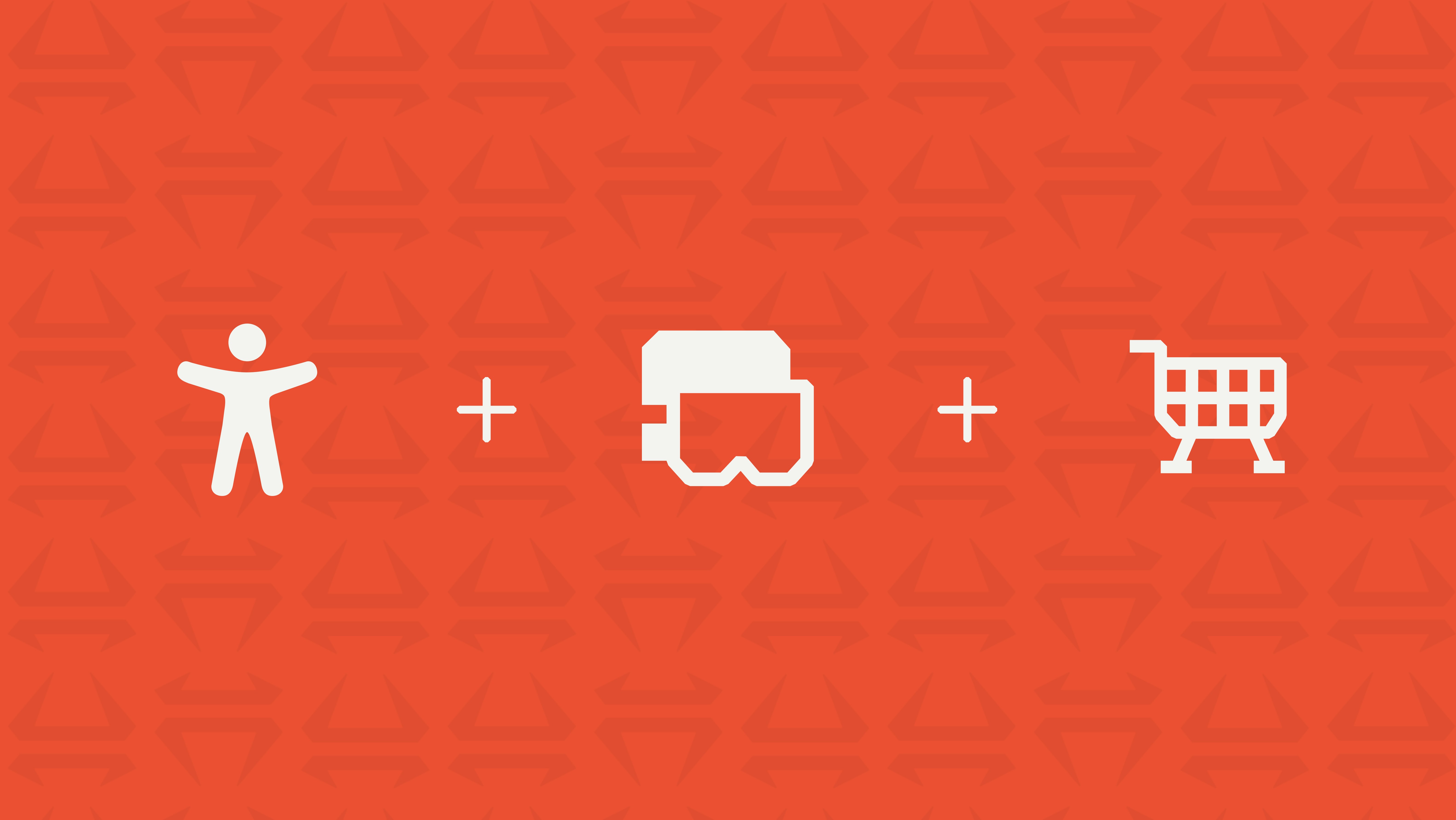
Our Persona Spectrum allowed us to address the possible physical limitations our users would need support for while going down the slopes. Our research found that a “Ski’Kart,” knee brace, and over-the-glasses (OTG) goggles offered solutions for various levels of physical disability.

After confirming our persona spectrum, we attached user personas to each disability equipment listed above. We told the emotional stories of renting equipment from the user's perspective via user journeys, learning both the strong and weak points of the online renting process.

  1. Visual Identity/Branding

Adjusting our altitude

Adjusting our Altitude

We wanted our brand to stand out against competitors, so we focused on an identity that comes from tradition and a strong cultural history. We chose Chile for our companies origin, known for the Andes mountains.

For our brand colors, we used the ores often found in the mountains of Chile. Additionally, our name "Torocima" is in reference to Chilote mythology, the "Camahueto" which is a bull-unicorn.

We wanted our brand to stand out against competitors, so we focused on an identity that comes from tradition and a strong cultural history. We chose Chile for our companies origin, known for the Andes mountains.

For our brand colors, we used the ores often found in the mountains of Chile. Additionally, our name "Torocima" is in reference to Chilote mythology, the "Camahueto" which is a bull-unicorn.

  1. Mapping

Snowing Where to Go

We learned that users wanted an easier way to transport equipment to and from the resort. Our inspiration came from current design systems: we looked at Airbnb for the rental process, Nike for e-commerce, Ticketmaster for UI layout, and Swissrent, a Swedish ski rental company to understand our competitor market.

We learned that users wanted an easier way to transport equipment to and from the resort. Our inspiration came from current design systems: we looked at Airbnb for the rental process, Nike for e-commerce, Ticketmaster for UI layout, and Swissrent, a Swedish ski rental company to understand our competitor market.

Using our previous user research and product strategy, I built an information architecture that focuses on three main navigation pages: Home Page, Store Page. Account Page. While majority of these features won't be included in the main user flow, It's important to include them to get a better understanding of how different sections of an interface can connect.

Using our previous user research and product strategy, I built an information architecture that focuses on three main navigation pages: Home Page, Store Page. Account Page. While majority of these features won't be included in the main user flow, It's important to include them to get a better understanding of how different sections of an interface can connect.

Using our previous user research and product strategy, I built an information architecture that focuses on three main navigation pages: Home Page, Store Page, and Account Page. While majority of these features won't be included in the main user flow, It's important to include them to get a better understanding of how different sections of an interface can connect.

Information Architecture

Information Architecture

Based on the information architecture, I assessed our user flow. From opening the app to receiving a rental order "ticket", we learned the journey that the user will go through and the minute details that could effect their overall experience.

User Flow

User Flow

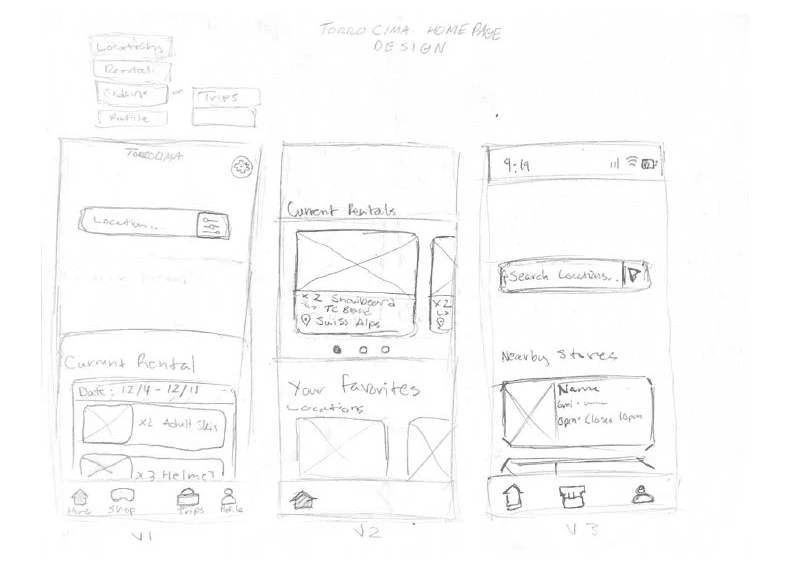
Home Page Wireframes Iterations

Rental Process Flow Wireframes

Shopping/Store Wireframes

Then, we optimized the rental process into 3 simple steps: Store location, rental dates, and product choice. However, we struggled with designing a “rental ticket” given to the user after completing a purchase. The first ticket design didn’t emphasize the correct information, and we planned to figure out how to fix it through user testing and interviews.

Optimized Flow

Optimized Flow

  1. Validation

Frost Impressions Matter

After testing our flow on five users from our survey, we gained valuable insights into our user flow experience:

  • A "Ticket" in our app is the digital receipt that the user gets when they confirm their order with us, and they will be updated on the order timeline.


  • We learned that emphasizing the product image in the rental ticket worked better for users than a photo of the store they were choosing to rent from.

  • Adding text to the “+” button on the home page made it easier for users to know where you start the process.

  • Adding text to the “+” button on the home page made it easier for users to know where you start the process.

  • Adding more screens and a timeline to the checkout process will increase the user's sense of accomplishment and security in purchasing. Finally, a summary card should be put in to confirm the user’s purchase.

  1. Design System

Following our Tracks

Using our brand identity and information layout as a foundation, we developed a design system that includes our icons, typography, buttons, and color usage.

Using our brand identity and information layout as a foundation, we developed a design system that includes our icons, typography, buttons, and color usage.

Icon System

We maintained our "cut edges" look in our icons that is present in our UI and logos. When it came to the user picking a store, we thought it was important to differentiate between inside a ski-resort (mountain icon), and the ones that would be by themselves (warehouse icon).

Type System

Type System

Our main logo font wasn't included in our mobile type due to being illegible at small sizes, so we stayed with Schwager Sans and added a san serif font, "Elza Text."

Button Components

Button Components

For this project over we designed over 25+ components, all of which add to 54 variables of those components.

Color Usage Psychology

We made sure to limit the use of our main brand color (jasper) throughout our UI pages, which would maximize attention in the areas deemed most important through user testing and business goals.

  1. Final Product + Key Features

Reaching the Peak

Complete User Flow

Using the Torocima app, you can easily rent out your snow sports equipment in minutes compared to the hours it takes to do in-person.


Our flow highlights choosing a store location, picking dates, and find a product through our store page. Additionally, we have accessibility options for equipment transportation.

Complete User Flow

Using the Torocima app, you can easily rent out your snow sports equipment in minutes compared to the hours it takes to do in-person.


Our flow highlights choosing a store location, picking dates, and find a product through our store page. Additionally, we have accessibility options for equipment transportation.

Locker Drop-off

A key feature of Torocima’s renting process is giving the user the option of in-store pickup or delivery to their ski resort's locker. Originally intended only for users with mobility constraints who need a “Ski’Kart,” this feature is now available for every customer. However, free delivery is only offered to “Ski’Kart” users.

Locker Drop-off

A key feature of Torocima’s renting process is giving the user the option of in-store pickup or delivery to their ski resort's locker. Originally intended only for users with mobility constraints who need a “Ski’Kart,” this feature is now available for every customer. However, free delivery is only offered to “Ski’Kart” users.

Favorited Items

Located on the home page, the favorited items feature makes the rental process even faster for by allowing the users to save items for easy access. 

Favorited Items

Located on the home page, the favorited items feature makes the rental process even faster for by allowing the users to save items for easy access. 

Customer Reviews 

Adding customer reviews to store locations and rentable products provides a sense of authenticity and trust in Torocima’s equipment and gives customers more freedom when purchasing items.

Customer Reviews 

Adding customer reviews to store locations and rentable products provides a sense of authenticity and trust in Torocima’s equipment and gives customers more freedom when purchasing items.

  1. Impact + Reflection

Ski Ya Later

User Impact

User Impact

Torocima users cut their renting time in half through our streamlined online rental process. This gives the users more time to enjoy the slopes with friends and family, increasing the ROI on their trips.

Torocima users cut their renting time in half through our streamlined online rental process. This gives the users more time to enjoy the slopes with friends and family, increasing the ROI on their trips.

Market Disruption

Market Disruption

Torocima is one-of-a-kind in its current market; no other third-party rental service matches the accommodations, renting speed, or stylish gear provided in one experience.

Torocima is one-of-a-kind in its current market; no other third-party rental service matches the accommodations, renting speed, or stylish gear provided in one experience.

Reflection

Reflection

Through persona spectrums and surveys, I gained an appreciation for accessibility and user research. I also became more aware of the challenges to accessible e-commerce and what a proper system needs to operate. In the future, I hope to design more products that are equal in visual beauty and functionality. 

Through persona spectrums and surveys, I gained an appreciation for accessibility and user research. I also became more aware of the challenges to accessible e-commerce and what a proper system needs to operate. In the future, I hope to design more products that are equal in visual beauty and functionality. 

Thanks for visiting!

Thanks for visiting!

Thanks for visiting!

My links